


Virtual art gallery website
The responsive website was designed using the same user research as the app for the virtual art gallery.
Sitemap

Creating a site map considering user pain points and clarity. Making sure the website structure is simple and easy by incorporating a strategy-based information architecture.
Starting The Design
Paper wireframe

I sketched paper wireframes for the Home Screen to ensure it addressed the pain points for users.
My focus was on making the user experience simple and easy.

Users access the site with various devices, so I believe optimizing the browsing experience for devices such as mobile and tablet is essential for the most efficient user experience.
Digital wireframes

Creating a digital wireframe based on a paper wireframe makes it easier to identify improvements.

Screen size variations
Low-Fidelity Prototype

Creating a low-fidelity prototype, I connected the primary user flow for creating an account, browsing artworks, and the checkout process.
Usability study
Study type:
Unmoderated usability study
Location:
United States, remote
Participants:
5 participants
Length:
20-30 minutes
These were the main findings uncovered by the usability study:
Button
The button for adding information confused users during the checkout process.
Account
Users felt that the link for creating an account needs to be more noticeable for new users.
Checkout
Three windows for adding information to the checkout process made it inefficient for some users.
Refining The Design
Based on the insights from the usability study, I made changes to improve the checkout process. Using a simple user flow, users can add and view all information simultaneously.

After usability study
Before usability study
Mockups
Original screen size


Screen size variations

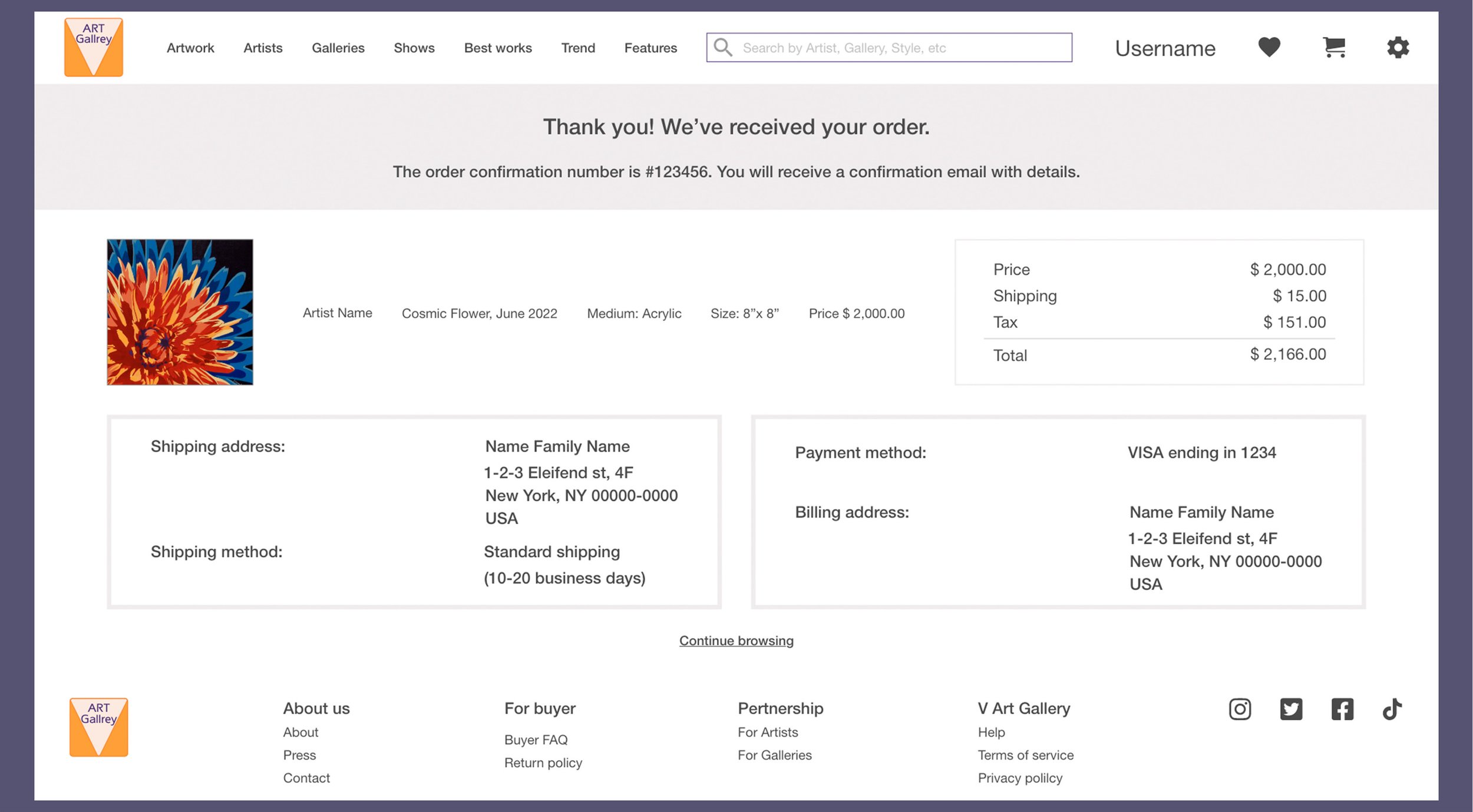
High-Fidelity Prototype

The high-fidelity prototype followed the same user flow as my low-fidelity prototype, incorporating design changes based on the usability study.
Accessibility considerations
I used landmarks in order to make navigation easier.
I used a typographic hierarchy for visual clarity.
I provided access to the AR feature for users to visualize how the artwork fits in their room.
Takeaways
Impact
The design was easy to use for most users, and it met their needs.
What I learned…
It has become clear to me that even small design changes can have a significant impact on the user experience. The key to improving design ideas and solutions is to learn what users really need.